

If you've been keeping an eye on web design trends, there’s a very high chance you’ve heard of responsive design.
But what exactly is it?
And why is it so important for your website?
We'll dive deep into the concept of responsive design and explore its benefits for your online presence.
What is Responsive Design?
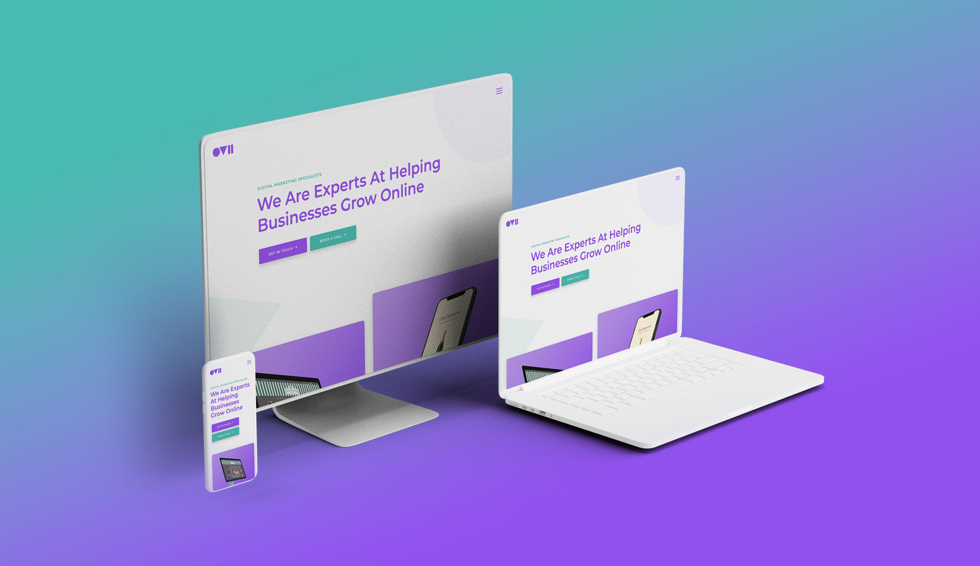
Responsive design is an approach to web design that aims to provide a seamless user experience across all devices, regardless of their screen size or orientation.
A website with a responsive design will look and function equally well on a desktop, laptop, tablet, or smartphone, without requiring the user to zoom in or scroll horizontally.
To achieve this, responsive design uses a combination of flexible layouts, images, and CSS media queries that adapt to the screen size of the device being used.
This means that the website will automatically adjust its layout and content to fit the screen, without compromising on readability or usability.
How Responsive Design Works
Responsive design ensures that a website appears and works smoothly across all devices.
But how does it work exactly?
Let’s delve deeper into the components of responsive design and how they come together to create a user-friendly website.
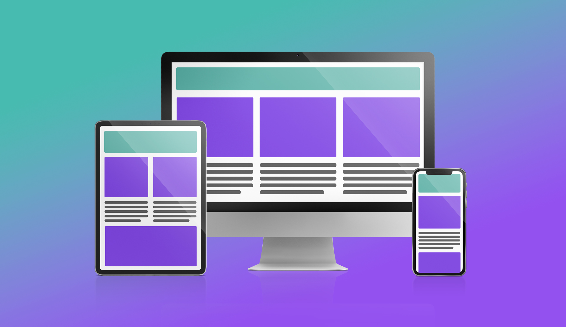
Flexible Grids
One of the primary components of responsive design is a flexible grid.
The website's layout relies on a grid system that adjusts to different screen sizes.
The content then fits within the columns and rows of the grid, and the website expands or contracts to fit different devices without losing its design or layout.
Flexible Images
Another significant factor of responsive design is the use of flexible images.
Images that are not optimised for different screen sizes can hinder the website's mobile-friendliness.
By using flexible images, the website can automatically adjust the size of the images to fit the screen size of the device.
This ensures that images appear sharp and clear, regardless of the device.
Media Queries
Media queries are crucial to responsive design.
They allow the website to determine the screen size of the device being used and adjust the layout and content accordingly.
By using CSS code, media queries determine the screen size and apply different styles and layouts based on that size.
This allows the website to function seamlessly on all devices.
Responsive Design in Action
How do these components work together to create a responsive website?
Imagine a website with a fixed layout.
While it may appear excellent on a desktop computer, it may be challenging to read on a mobile device.
The small screen of mobile devices would cause the text to be really small, requiring the user to zoom in and scroll horizontally.
However, by implementing responsive design, the website's layout becomes flexible and adjusts to the screen size of the device.
The grid system adapts to the screen size, and the content rearranges to ensure readability and user-friendliness.
Benefits of Responsive Design
Responsive design has emerged as an essential component of contemporary web design, delivering numerous benefits that can enhance a website's overall performance.
We'll examine the most significant advantages of responsive design and how it can benefit your website.
Improved Page Speed
A website's loading speed significantly impacts the user experience.
Responsive design optimises your website's loading speed for all devices.
This makes sure that your website loads quickly, which improves website optimisation and user experience.
Saving Time and Money
Single Website for All Devices
Responsive design enables you to have one website that functions seamlessly across all devices.
This means that you no longer have to create multiple versions of your website for various devices.
Gone are the days when you needed to create a minimum of 2-3 websites for various screen sizes.
Now one website is all you need.
This reduces the amount of time and effort required for development and maintenance.
Easier Website Management
This is a knock-on benefit of having a single website for all devices.
It means that when managing your website you only have one website to manage.
Managing one website instead of multiple versions simplifies your website's content, design, and functionality management.
Changes made to the website are applied across all devices, eliminating the need to make changes to multiple versions of the website.
Lower Development Costs
We know websites are constantly evolving, just like your business.
So when your business evolves, you’re website needs to evolve with it.
This requires your website to be updated with new pages and functionality.
By having one website instead of multiple versions, you can reduce development costs.
Developing multiple versions of the website requires more time and resources, which can be costly.
With responsive design, you can cut development costs and allocate resources to other areas of your website.
A Future-Proof Website
Responsive design future-proofs your website.
There’s no point in creating a website that uses technology and best practices that are already out of date is there?
Creating a responsive website ensures that your website remains functional and accessible on new devices that may emerge in the future.
This also means that you don't have to invest in redesigning your website every time a new device is released, saving you time and money in the long run.
Improved User Experience with Responsive Design
Responsive design has transformed the way we design websites.
User experience is one of the main aspects that have benefited from responsive design.
Accessible on All Devices
One of the significant benefits of responsive design is its ability to make your website accessible on all devices.
Users can access your website from their desktop, laptop, tablet, or smartphone, without any difficulties, ensuring an outstanding user experience.
Consistent User Interface
Another significant advantage of responsive design is that it provides a consistent user interface across all devices.
Users experience the same design, branding, and layout, regardless of the device they use.
This creates a sense of familiarity.
Mobile-Friendly Design
Responsive design ensures that your website is mobile-friendly, allowing users to access and navigate your website effortlessly from their mobile devices.
With over 50% of users now browsing websites on their mobile devices, having a mobile-friendly design is crucial to keeping users engaged and reducing bounce rates.
Easy to Navigate
Responsive design ensures that your website is easy to navigate, regardless of the device used.
Responsive elements such as ‘Hamburger’ menus allow visitors to navigate through your website easily.
When users can quickly locate the content they require, this massively enhances their user experience.
Increased Engagement
Responsive design increases engagement by providing an improved user experience.
A website that is easy to navigate, accessible on all devices, and has a consistent user interface increases the likelihood of users spending more time on your website.
The more time they spend on your website, the more they associate with your brand.
This increased engagement is highly likely to result in a higher conversion rate.
Better SEO with Responsive Design
Improved SEO performance
Responsive design is not only about improving user experience, but it can also significantly improve your website's search engine optimisation (SEO) performance.
Mobile-friendly websites receive preferential treatment from Google and other search engines, resulting in higher rankings in search engine results pages (SERPs).
This can result in increased traffic, higher click-through rates, and ultimately more conversions.
Google’s Mobile-First Index
At the end of 2017, Google started to roll out their mobile-first index.
This means that Google now predominantly uses the mobile version of a site's content for indexing and ranking.
This is called mobile-first indexing.
As such, Google’s mobile-first index prioritises mobile-friendly websites in search engine rankings.
If your website is not mobile-friendly, it may not rank as high in search engine results pages (SERPs).
By adopting a responsive design, you ensure that your website is mobile-friendly and optimised for all devices, which can enhance your website's chances of ranking higher in SERPs.
One URL for All Devices
So not only does a responsive website mean that only one version of a website is required for all screen sizes, but only one URL is required as well.
This eliminates the need to create separate URLs for mobile and desktop versions of your website.
Having a single URL streamlines your website's structure, making it easier for search engines to crawl and index your website.
Lower Bounce Rates
A website that is not mobile-friendly can cause users to lose interest quickly, resulting in increased bounce rates.
High bounce rates can also negatively impact your website's SEO performance.
Responsive design adjusts your website's layout and content to fit the screen size of the device, reducing bounce rates, and keeping users engaged for longer periods.
Testing Your Website on Different Devices
To ensure that your website is truly responsive, it's essential to test it on different devices.
We'll look into why testing your website on different devices is crucial and how you can go about it.
Why Test Your Website on Different Devices?
Testing your website on different devices is critical for several reasons, including:
- Consistency: Ensures that your website looks and functions consistently across all platforms, providing a seamless user experience.
- Identifying Issues: Helps you identify any issues or bugs that may arise when viewed on a particular device or screen size. This allows you to address these issues before they impact user experience.
- Optimising Performance: Helps you optimise its performance, ensuring that it loads quickly and functions smoothly on all platforms.
How to Test Your Website on Different Devices
Testing your website on different devices can be done in several ways, including:
Manual Testing
The first method is by manually testing your website on different devices.
This involves physically viewing your website on these different devices, such as on different desktops, laptops, tablets, and smartphones.
The first potential issue with this is having access to all these different devices.
I don’t know many people that own 3 smartphones, a desktop computer, 2 laptops and an iPad!
This method can also be time-consuming.
But the advantage of this method is it provides a more comprehensive understanding of how your website looks and functions across all platforms.
Sometimes with software they can’t fully recreate the real thing.
We’ve found this to be particularly the case with mobile phones.
So where possible we would always recommend checking the responsive design on your mobile phone.
Automated Testing using Online Tools
This alternative method of testing involves using software to test your website on different devices.
The clear advantage of this method is that it’s faster than manual testing.
It also means you don’t need to own all these devices yourself or at least have access to them.
However, this automated testing may not provide as accurate results as using the actual devices.
We recommend using both methods.
Start with automated testing.
And then move to manual testing.
If you don’t have many devices to manually test on, then the most important device to test your responsive design on is your mobile phone.
Now for automated testing there are several online testing tools available that allow you to test your website on different devices.
These tools simulate how your website looks and functions on different devices, providing a convenient and cost-effective way to test your website's responsiveness.
Some options for premium automated testing tools include BrowserStack and Selenium.
Responsinator is also a good free option to use.
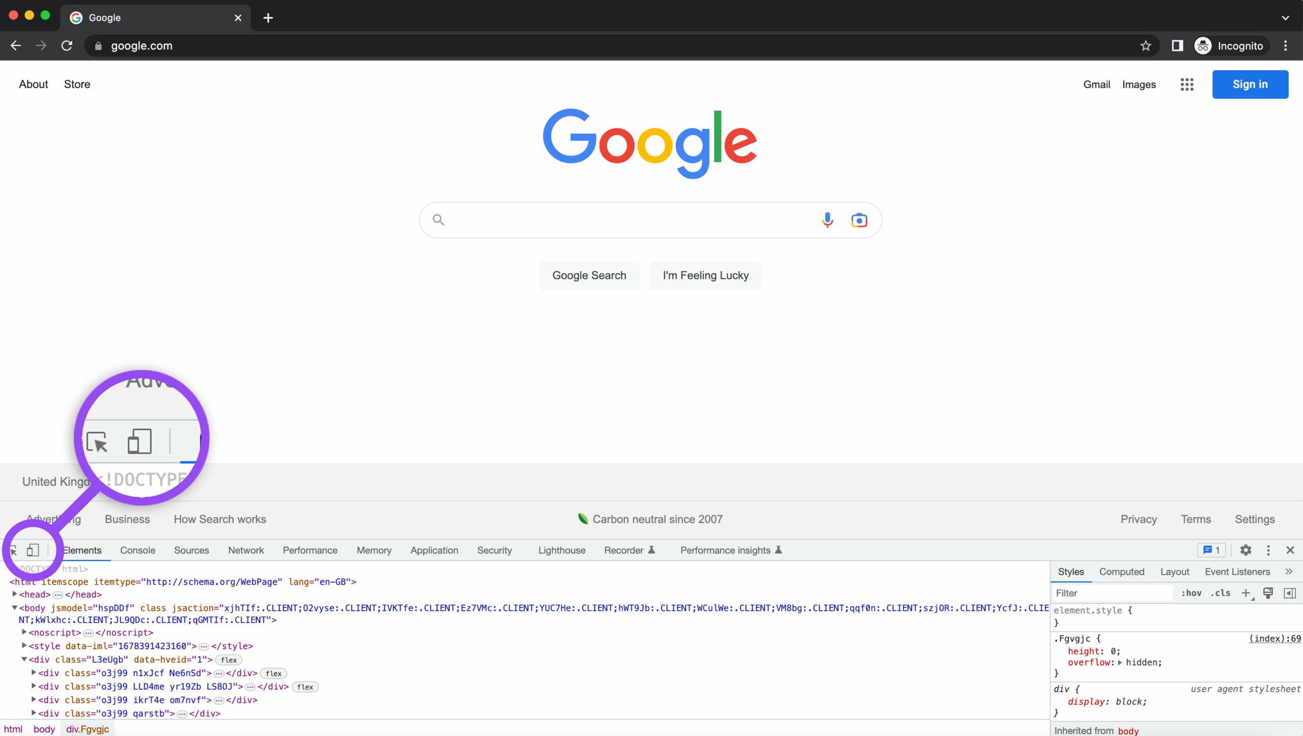
However one of our go-to testing tools is the Google Chrome Inspector Tool.
To use this free tool simply right-click on your website and select ‘Inspect’.
You can then click the responsive button to view your website at any screen dimension.
Conclusion
Responsive design is essential for creating a website that provides an optimal user experience across all devices.
So much so that it’s considered standard practice in the web design field.
By investing in responsive design, you can create a website that meets the needs of your audience and performs well in terms of user engagement and website performance.